What Makes a Good Logo for B2B Companies?
B2B logos are not fashion statements. They are trust signals.
In complex industries like B2B technology, cybersecurity, and government contracting, clarity beats cleverness. A good B2B logo must communicate credibility, stability, and focus in seconds. It appears on proposals that determine million-dollar contracts. It sits at the top of pitch decks presented to skeptical procurement committees. It gets printed on government compliance documentation.
Your buyers are risk-averse. Your logo is the first signal that you understand their world. Think of it like the opening scene of a movie. You have about five seconds to convince the audience not to walk out. Except in enterprise sales, walking out costs you six figures.
So what makes a good logo for B2B companies? It comes down to trust, simplicity, scalability, and strategic restraint. Here is what separates logos that win enterprise deals from logos that get ignored.
A Good B2B Logo Signals Trust First
Enterprise buyers do not take risks on brands that look unfinished. When a VP of IT is choosing between vendors for a multi-year contract, the logo on the proposal matters. It signals investment, permanence, seriousness.
Look at the logos that dominate enterprise sales:
![]()
IBM (ibm.com): Horizontal stripes. Simple geometry. Blue. No flourishes. It has looked essentially the same for 50 years. That consistency signals stability.
![]()
Cisco (cisco.com): Clean wordmark with a subtle San Francisco bridge reference. Restrained. Professional. Not trying to be clever.
![]()
Salesforce (salesforce.com): Cloud icon that is simple enough to work at any size. Friendly but not frivolous. Enterprise-appropriate.
![]()
Deloitte (deloitte.com): Green dot. Simple wordmark. Nothing complicated. Signals consulting authority without overdesign.
![]()
ServiceNow (servicenow.com): Clean type. Teal color. No unnecessary shapes. Works on contracts, slide decks, login screens.
What these share: simplicity, authority, restraint. None of them are trying to be the most creative logo in the room. They are trying to be the most trustworthy.
It is the logo equivalent of wearing a suit to a job interview. Nobody is impressed by your creativity. They are checking if you understand the assignment.
Simplicity Wins in Complex Markets
A complex product does not need a complex logo. In fact, the opposite is true. When you sell cybersecurity infrastructure or AI-powered analytics platforms, your logo should reduce cognitive load, not add to it.
Overdesigned logos age quickly. Gradients look dated. 3D effects feel cheap. Intricate details disappear at small sizes. Remember when every sci-fi movie poster in the 2000s had blue and orange contrast lighting? That looked great until it did not. Same principle.
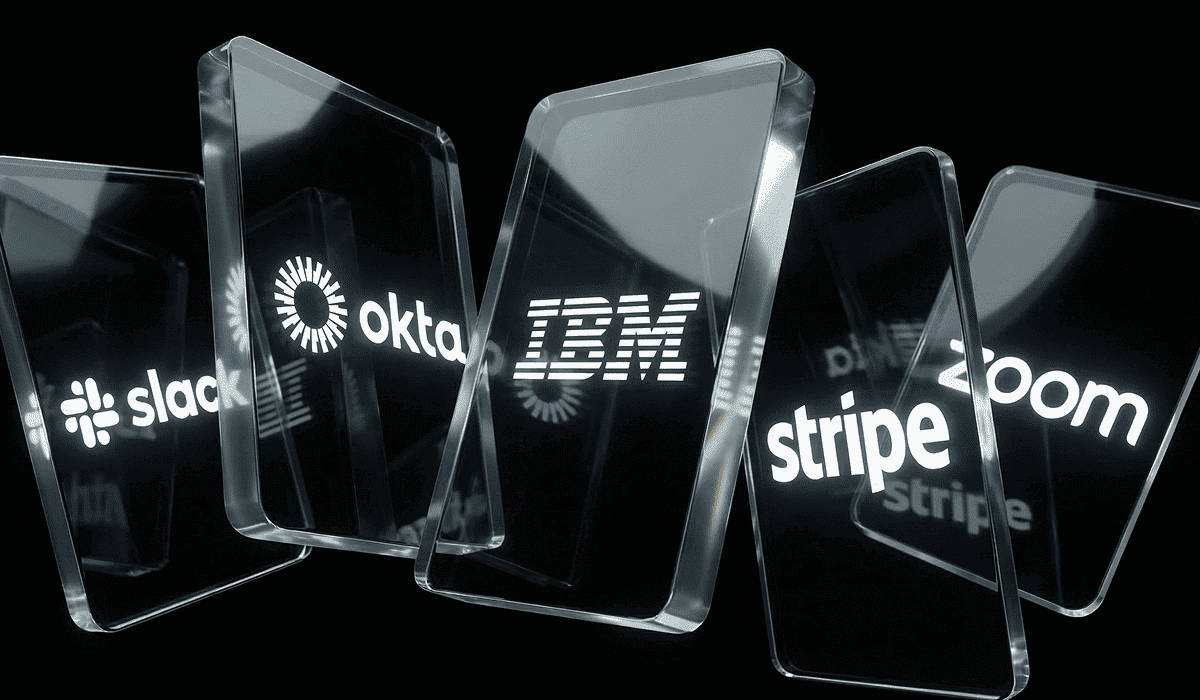
Consider these B2B technology companies:
![]()
Stripe (stripe.com): Wordmark in a custom typeface. No icon. Flat color. Works everywhere. Scales perfectly from browser tab to billboard.
![]()
Zoom (zoom.us): Bold wordmark with distinctive rounded letterforms. The overlapping circles in the O’s create a simple, memorable pattern. Clean geometry. High contrast. Works in single color. Scales perfectly from browser tab to billboard.
![]()
Slack (slack.com) post-refresh: Four simple shapes. Flat colors. Removed complexity from the original. Better for it.
![]()
Atlassian (atlassian.com): Geometric triangle. One color. That simplicity works across Jira, Confluence, Trello, everywhere.
These logos pass critical tests:
- They work in black and white
- They remain legible at favicon size
- They reproduce cleanly in single-color print
- They scale from mobile apps to conference booths
If your logo needs color gradients to work, it does not work.
Memorability Without Gimmicks
A good B2B logo is distinct without being weird. It has a strong shape or silhouette. It uses typography that feels intentional. It controls color instead of throwing everything at the wall.
![]()
Dropbox (dropbox.com): Open box icon. Simple geometry. Recognizable shape even without color. The simplicity is the memorability.
![]()
HubSpot (hubspot.com): Three-pronged sprocket. Orange. Clean. Works as an icon, works as a pattern, works at any size.
![]()
Okta (okta.com): Geometric shape that suggests connection without being literal. Blue. Professional. No unnecessary details.
![]()
Snowflake (snowflake.com): Six-pointed star shape derived from actual snowflake geometry. Simple. Ownable. Works in any context.
None of these logos rely on gradients, effects, or trends. They are recognizable because of their core geometry and controlled color systems. That restraint is what makes them work in enterprise contexts.
Think Batman. Not the Schumacher version with nipples on the suit. The Nolan version. Stripped down. Functional. Intimidating without trying too hard. That is the energy your B2B logo needs.
Typography Matters More Than You Think
Most B2B companies use wordmarks, not pictorial logos. That makes typography the entire brand signal.
Enterprise buyers subconsciously judge quality based on typographic polish. Kerning matters. Letter spacing matters. Font choice matters. A cheap font signals a cheap product.
Consider enterprise typography:
![]()
Google (google.com) enterprise: Custom typeface. Clean geometry. Professional weight. Works across enterprise product suite.
![]()
Adobe (adobe.com): Bold, simple letterforms. Red icon as punctuation. The type does all the work.
![]()
Oracle (oracle.com): Custom type with distinctive letterforms. Red color for authority. Nothing extraneous.
![]()
SAP (sap.com): Three letters in a defined space. Blue. Simple. Enterprise-appropriate for 50 years.
For B2B technology companies and cybersecurity companies, custom typography builds defensibility. It signals investment in the brand. It separates you from competitors using stock fonts.
When government contractors use Arial or Helvetica, they signal that brand is not a priority. When they invest in a custom or well-chosen type, they signal professionalism. It is the difference between the opening crawl of Star Wars and… well, any other movie that tries to copy it. You know the real thing when you see it.
The Logo Must Work in the Real World
A logo is not a static file. It exists across contexts:
- Website header at multiple breakpoints
- Mobile app icon competing with hundreds of others
- Favicon in browser tabs
- Slide decks presented to procurement committees
- Trade show booth graphics at large scale
- Social media avatars at 200×200 pixels
- Government contract documentation in black and white
- Email signatures in Outlook
Before finalizing a logo, test it:
- Does it scale to 16×16 pixels and remain recognizable?
- Does it reproduce cleanly in single-color print?
- Does it work on light and dark backgrounds?
- Does it look credible next to enterprise competitors?
If the answer to any of these is no, the logo fails.
What Makes a B2B Logo Bad?
Bad B2B logos follow patterns. Here are the most common failures:
Overused shields in cybersecurity: Every third cybersecurity company uses a shield. It signals nothing. It blends into a sea of identical competitors. If your differentiation is real, your logo should reflect that. Using a shield in cybersecurity is like naming your villain Darkblade or Shadowmancer. Technically it works, but come on.
Literal icons: Cloud plus lock plus circuit board. This is not design. This is a rebus puzzle. If you need three icons to explain what you do, your positioning is unclear. It is like trying to explain The Matrix by showing someone a picture of sunglasses, a phone booth, and a pill. Technically accurate. Completely unhelpful.
Excessive gradients: Gradients age poorly. They break in single-color applications. They look cheap in print. A gradient is not a brand strategy.
Startup playful logos in enterprise sales: A logo with a winking mascot does not belong on a government contract. Know your audience. If you sell to procurement committees, design for procurement committees. Showing up to an enterprise sales meeting with a cartoon logo is like Michael Scott showing up to a client pitch with a magic trick. Technically you are there. Nobody is signing.
Trend-driven shapes: Geometric patterns that were trendy in 2018 look dated in 2026. Design for longevity, not Instagram likes. Remember when everyone in Back to the Future Part II wore self-lacing Nikes and auto-adjusting jackets? That is what your 2018 geometric logo feels like now. Technically from the future, but the wrong future.
The common thread: these logos prioritize aesthetics over function. A B2B logo is not art. It is a tool. It must work.
A Logo Is a System, Not Just a Mark
A logo file is not a brand. A brand is a system.
When Punch builds a brand for B2B technology companies, cybersecurity companies, or government contractors, we deliver:
- Usage rules: Clear space, minimum sizes, color variations, what not to do
- Typographic system: Primary and secondary typefaces, hierarchy, sizing
- Color hierarchy: Primary brand color, supporting palette, usage rules
- Digital behavior: How the logo animates, loads, transitions between contexts
- Application examples: Website, slide templates, proposal covers, social graphics
Without this system, the logo will be misused. Marketing will use the wrong color. Sales will stretch it in slide decks. The website will display it inconsistently.
A brand system ensures consistency. Consistency builds trust. Trust drives enterprise sales. It is not complicated. Unless you try to explain it to someone who has not read the brand guidelines. Then it becomes like explaining the plot of Inception. Technically you know what is happening, but nobody else does.
Final Test: The 5-Second Rule
Before approving a B2B logo, ask three questions:
Would a skeptical buyer trust this?
Show the logo to someone outside your company. Ask if they would sign a contract with this brand. If they hesitate, the logo fails.
Would this look credible on a government contract?
Government contractors know this test. Procurement officers judge professionalism instantly. Your logo must pass that judgment.
Would it age well in 5 years?
Trends fade. Rebrands are expensive. Design for longevity. Simplicity ages better than complexity.
If the logo passes all three tests, it works.
Frequently Asked Questions
What makes a good B2B logo?
A good B2B logo signals trust, scales across applications, remains simple enough to work in black and white, and uses intentional typography. It prioritizes credibility over creativity.
How is a B2B logo different from a consumer logo?
B2B logos must work in enterprise contexts: proposals, contracts, compliance documentation, procurement reviews. They signal stability and professionalism. Consumer logos can be playful or trendy. B2B logos must be trustworthy and timeless.
Should B2B logos be simple?
Yes. Simplicity ensures scalability, reproducibility, and longevity. Complex logos age quickly and fail at small sizes. The best B2B logos use clean geometry, controlled color, and strong typography.
Do cybersecurity companies need shields in their logos?
No. Shields are overused in cybersecurity and signal nothing. If your differentiation is real, your logo should reflect that differentiation, not generic category symbols.
How often should a company redesign its logo?
Rarely. Rebrands are expensive and disrupt recognition. A well-designed B2B logo should last 10-20 years. Redesign only when the current logo actively hurts credibility or no longer reflects the business strategy.